STEAMPUNK (2020-) by CIT Coin Invest
What do you get if you take an early-industrial Victorian aesthetic, and mix it with a more futuristic technology? You get Steampunk. Gears, steam-power, heavy industry and innovative transport and military, are all hallmarks of Steampunk, and it’s a genre that has enjoyed considerable literary success, although that hasn’t translated to the silver screen as much.
Steampunk is a very visual genre, and offers a fertile breeding ground for the imagination of artists, including those in the coin world. By far the greatest range of coins based around the concept is this one by industry masters, CIT, who’ve employed high-relief smartminting to bring this pseudo-Victorian world to life.
Each coin in the range showcases a small sub-genre of Steampunk. The first issue was a more general view, tying in with CIT’s habit of trialling new ideas before committing to a full series. The debut 2020 design was a stunner, and the full series was never in doubt. Since then, we’ve had issues focusing on specific devices (Jet Pack, Nautilus sub), and others on settings (Lab, Circus), but all have a consistent retrofuturistic aesthetic.
The base coin is a three-ounce silver one, so this isn’t a low-end series, and following on a couple of years later, they add a particularly gorgeous kilogram variant (3 of 5, so far). Both have the same design, and both employ a meticulously applied antique finish, with some restrained gilded highlighting – a killer combination. A terrific idea for a series, and one taken from concept to execution in the best possible way.
TABLE OF CONTENTS
STEAMPUNK
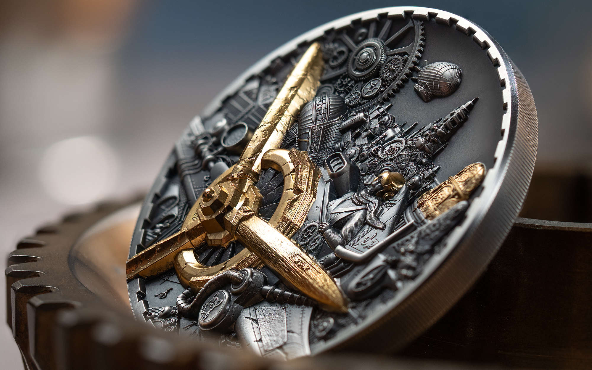
This is the coin that set up the design ethos moving forward. A more generalised image, it pulls from multiple elements to depict an overview of a steampunk cityscape. The figure in the foreground is quite sublime, and there are some neat little touches in the scene, like a tiny Penny Farthing bicycle, for example.
STEAMPUNK: JET PACK
For the second release, we see transport as a primary theme. There’s a train with a gilded front, a powered cable-car, and the return of the Penny Farthing, but it’s a fully gilded, retro-style jetpack that is the focal point. A gloriously over-the-top piece of steampunk design, only the corgi dog, suitably enhanced, is its equal.
STEAMPUNK: NAUTILUS
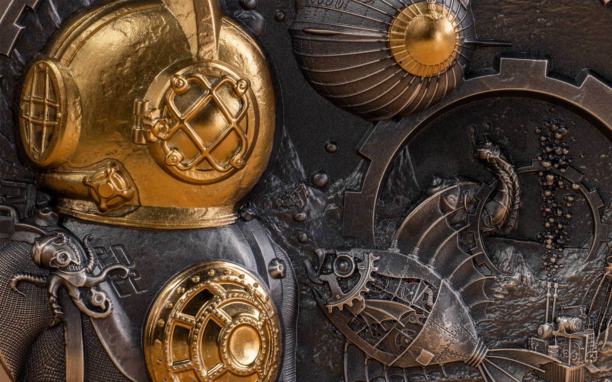
We dive deeply into the works of Jules Verne, and his 20,000 Leagues Under the Sea novel, written in 1869. As you can tell from that, the setting here is underwater, with the primary object being a diver, in an early diving suit. Next up is a submarine in a style reminiscent of The Nautilus. It’s all the little touches that elevate this one, however, with multiple examples of mechanically-enhanced aquatic life scattered around.
STEAMPUNK: SCIENCE LAB
For the fourth issue, we get to see where all this retrofuturistic technology emanates from. Called ‘Science Lab’, it portrays a scene of a scientist at work, surrounded by steampunk-style gadgetry, and with mechanically modified animals in attendance. We had a little laugh at the rat on the Penny Farthing.
STEAMPUNK: CARNIVAL
The 2024 issue is ‘Carnival’, replete with an enhanced strongman, a fully mechanical lion, picked out with gilding, and so many circus-inspired details, we have to wonder how they fitted them all in. It’s a more eclectic choice of subject than what has gone before, but it does give a nod to the great expo’s of the time. As for the Penny Farthing, it’s there if you look closely!
STEAMPUNK: AVIATION
The 2025 coin continues to bring the series to new heights (no pun intended), with this aviation design, depicting a steampunk monoplane flying over a cityscape. All the little touches, including the bicycle, are buried within the copious detailing.
COMMON OBVERSE
The obverse for both variants is basically identical, just differing in denomination. A very attractive, high-relief, geared design, that is multi-layered, and antique finished. The 2024 coins moved over to the Dan Thorne effigy of King Charles III, from the earlier Ian Rank Broadley effigy of Queen Elizabeth II.


