
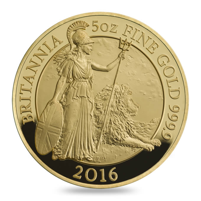
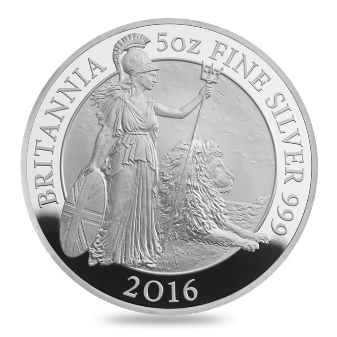
Just a quick look at the new and eagerly anticipated 2016 proof Britannia range. We’ll have full and better images up shortly, but here’s the design in gold and silver.
There are seven gold coins, in 5oz, 1oz, 1/2oz, 1/4oz, 1/10oz, 1/20oz and 1/40oz weights, available either individually or in set combinations. The silver is available in the same size range, 5oz and 1oz as individual coins, the rest only in sets. The star of the show are usually the stunning 5oz versions with their enhanced relief, pictured below. More soon.
COIN IMAGES
ADVERTISEMENTS


MINT LINK
These depictions show a very promising design, and I’m assuming the actual coins will look even better!
It does look pretty good, second to the 2014 for me. The mint was a little late with our press pack, but we should have full higher-res images of the coins up in the next day or so.
I, too, thought it looked better than last year’s, but having purchased one I am not really liking it that much after all (same as last year!). I think the centre circle should also be mirrored, to make the figures stand out more or do something else with it. Now they just get lost in it from some angles, especially the lion… Or I think even better, a coloured background of the sea/sky in blue with some white clouds etc would be spot on with this design, or a coloured globe!
I have to say I am feeling more and more disappointed by the Royal Mint lately. I’ve been a “more serious” collector for only 4-5 years, but I now find their designs too old fashioned, always about the same subjects (monarchy, historical/current events/people, emblems/crests etc) and no matter what the design, always the same few boring looks/finishes. How cool a Britannia it would be, if it had a coloured background indeed? Or why not turn her into a comic book heroine one year and do an antique high relief 1oz and/or 5oz version etc etc. No wonder the Beatrix Potter series coloured 50p coins were so popular. They were so un-Royal Mint like!
I respect they have been around for 1000 years, but to me it feels their ideas seem stuck in that period too – this much experience should really give them an edge compared to the other mints. Could you imagine this coin being produced by the Perth Mint? Or RCM or the Mint of Poland (let’s completely ignore CIT!)? I am finding myself collecting, for the sake of collecting – completing a series etc, lately with the RM coins. I haven’t really liked one for a long time (indeed since the 2014 Britannia!)…
Team GB, Fire of London, Shakespeare, the face value coins, Last Round Pound, World cup, Battle of Somme… Really? Are those the best designs/coins you can do RM? Beatrix Potter series aside, every other coin has been a disappointment for me this year.
Why not be more “current”, or risque, or innovate more for god’s sake! Every other mint does! Give the commomemorative coins a twist, remove the boring (sorry!) queen’s efigy from the obverse for a change, or make it small in a little circle or crest like so many other mints do. Then you have 2 sides to design! Imagine that… 🙂
Compare the £100 pound Buckingham Palace face value coin with the 2014 Masterpieces in Stone, Blue Room Buckingham Palace 3oz coin. I know the face value one is not meant to be a very limited 3oz premium coin, but from a design perspective, you get the jist of what I am trying to say.
Anyway rant over… 🙂 Had to get it off my chest!