American Eagle bullion coin redesign gets underway with a plethora of new options up for contention
After what seems to be an absolute age, the slow moving wheels of US government have finally decided the American Eagle bullion coin is due for a revamp, well, one side of it anyway. The stylish John Mercanti-penned heraldic style eagle on the silver coin is to be changed, as is the Miley Busiek design on the gold. Both have become ubiquitous because of the sheer number sold over the past 4 decades, so they have to get this right.
Unfortunately, the whole process of coin design at the US Mint seems to be highly politicised, with strict guidelines laid down for what, when and how many, but it does bring a side benefit of making the decision process open to examination. Two organisations, the Commission of Fine Arts (CFA) and the Citizens Coinage Advisory Committee (CCAC) offer advised choices to the Secretary of the Treasury, who can ignore them. The CFA met last week, and the CCAC met yesterday. The 39 designs for 2021 are outlined below.
To save on adding another 39 images, which you’d have to download, we’re showing the silver artwork, and then underneath each batch of four, noting what changes there are to the gold. In general, the changes between the metals are limited to the addition of the IN GOD WE TRUST inscription, along with the obvious metal and value difference. There are also security features to be incorporated that have yet to be detailed, as counterfeiting is one reason for the update.
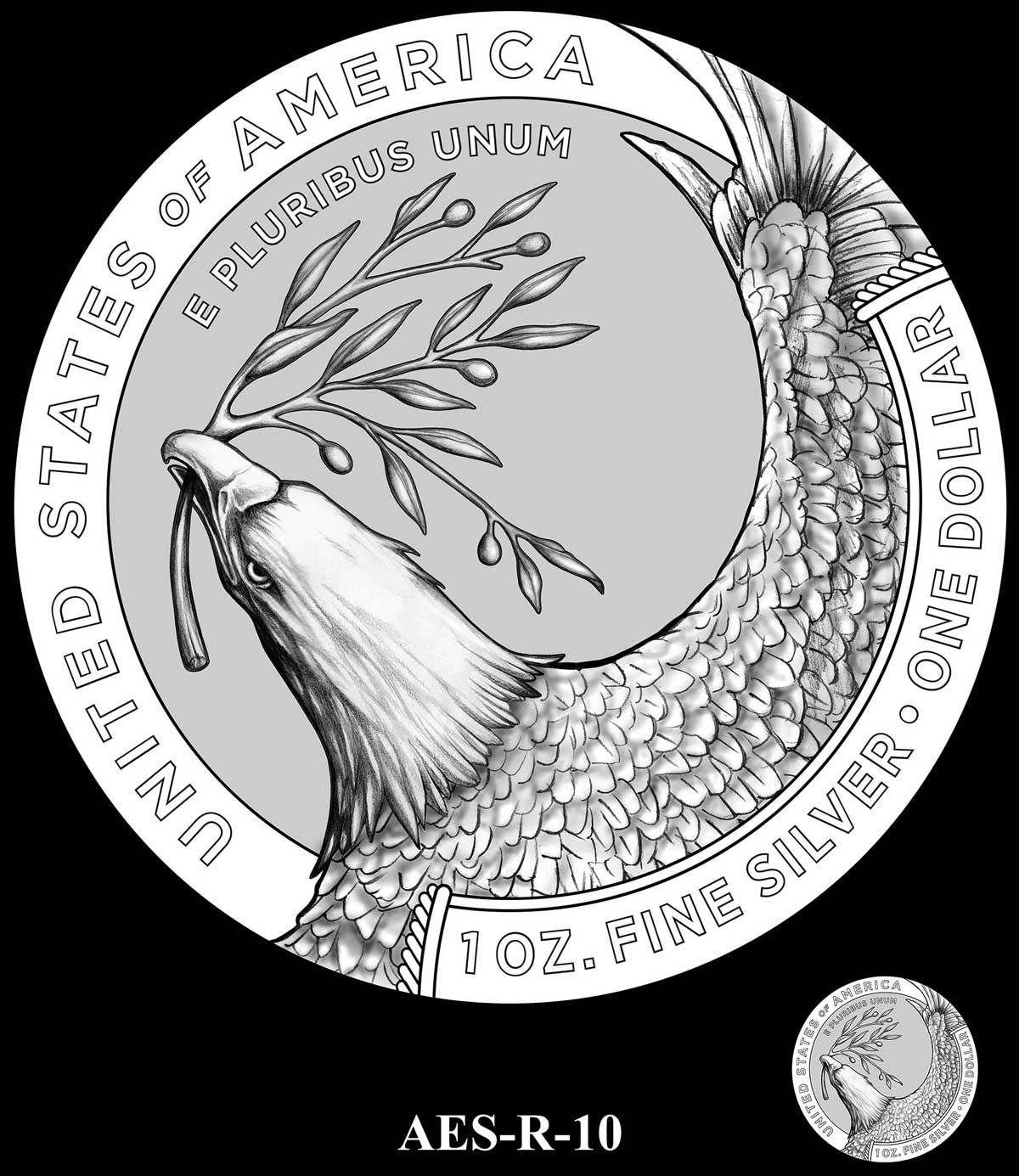
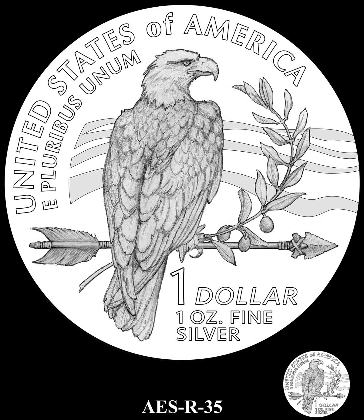
As for our favourites, we’d be happy to see a single bird on the silver and a more complex design on the gold, mirroring what we have to date. The designs incorporating a flag are tired cliche’s for me,and while R-10 looks great as a numismatic, the symbolism of an eagle with an olive branch isn’t how the world sees the US at present, which is what the bullion coin has to represent. There’s plenty of good stuff here, but nothing that jumps out as being clearly superior to the others. Pushed, I’d say R-35 would look great on the silver, incorporating all of the required symbolism in equal measure. I was never overly enamoured of the current gold design, so I’d go for something bolder and bigger, perhaps R-05 or similar. Tough choice.
Also, and I know this won’t happen, but I thought I’d put it out there for discussion, how about releasing maybe the six best designs not chosen for issue as a set in proof form? Changes like this don’t come along very often and it would make a nice snapshot of coin design for future generations. Some of those below would make very attractive proof coins and the US Mint sells them at pretty reasonable prices compared to many other national mints.
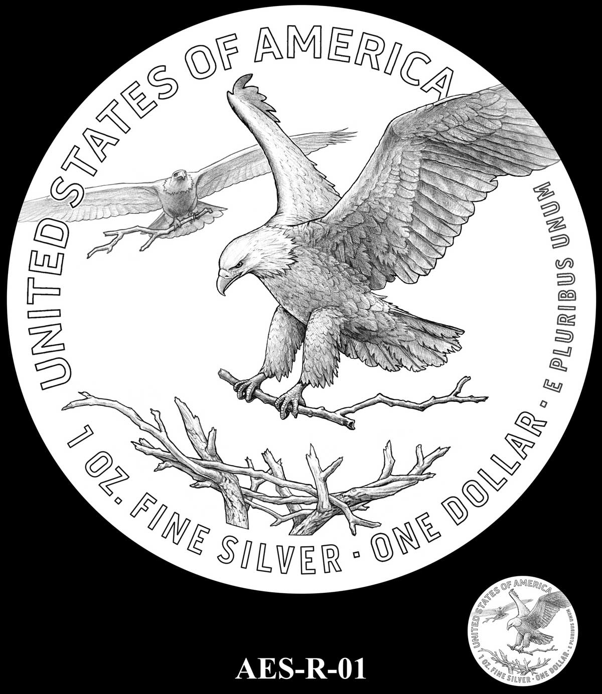
R-01 – The E PLURIBUS UNUM is moved to LHS space, IN GOD WE TRUST inscribed to RHS
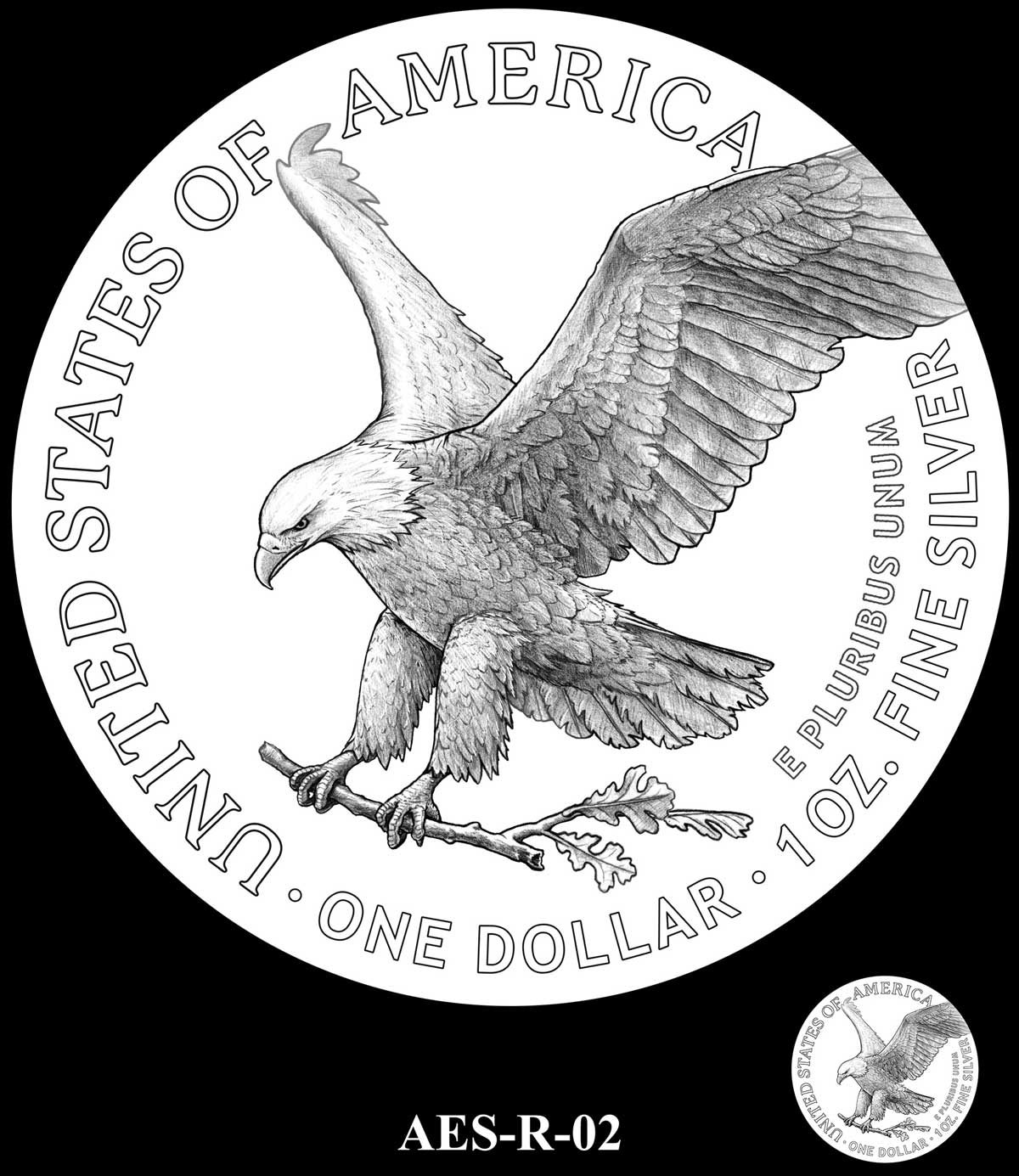
R-02 – The IN GOD WE TRUST added under STATES OF AMERICA inscription
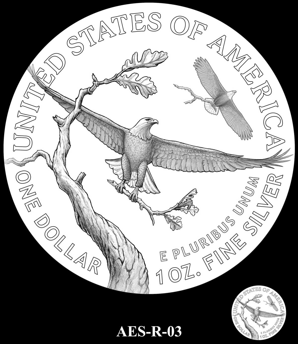
R-03 – E PLURIBUS UNUM moved to area under STATES, and its space filled with IN GOD WE TRUST
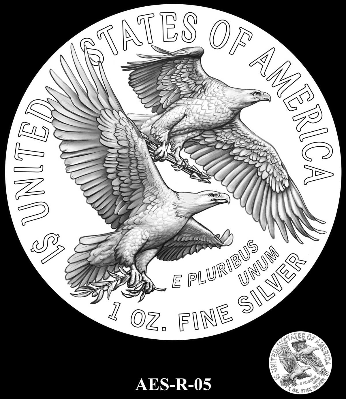
R-05 – IN GOD WE TRUST added under OF AMERICA
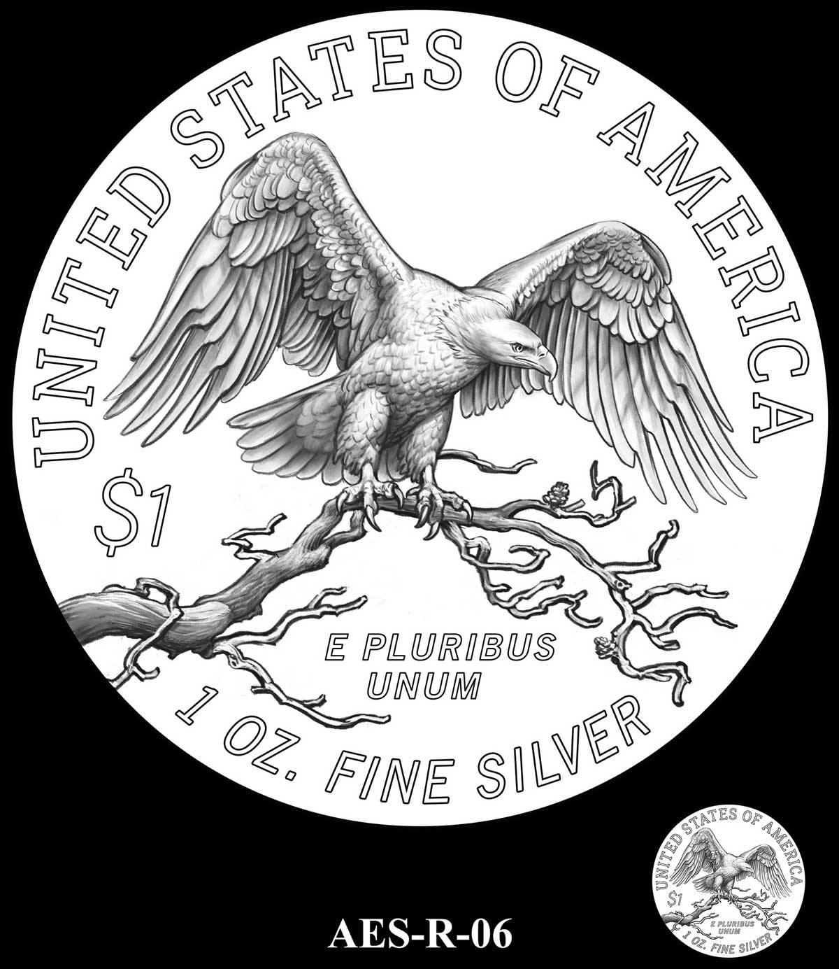
R-06 – IN GOD WE TRUST added in space at top
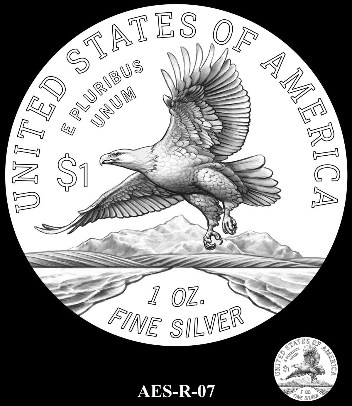
R-07 – IN GOD WE TRUST added in space at bottom. 1 OZ moved down
R-08 – IN GOD WE TRUST added in space at bottom
R-10 – IN GOD WE TRUST added in centre space
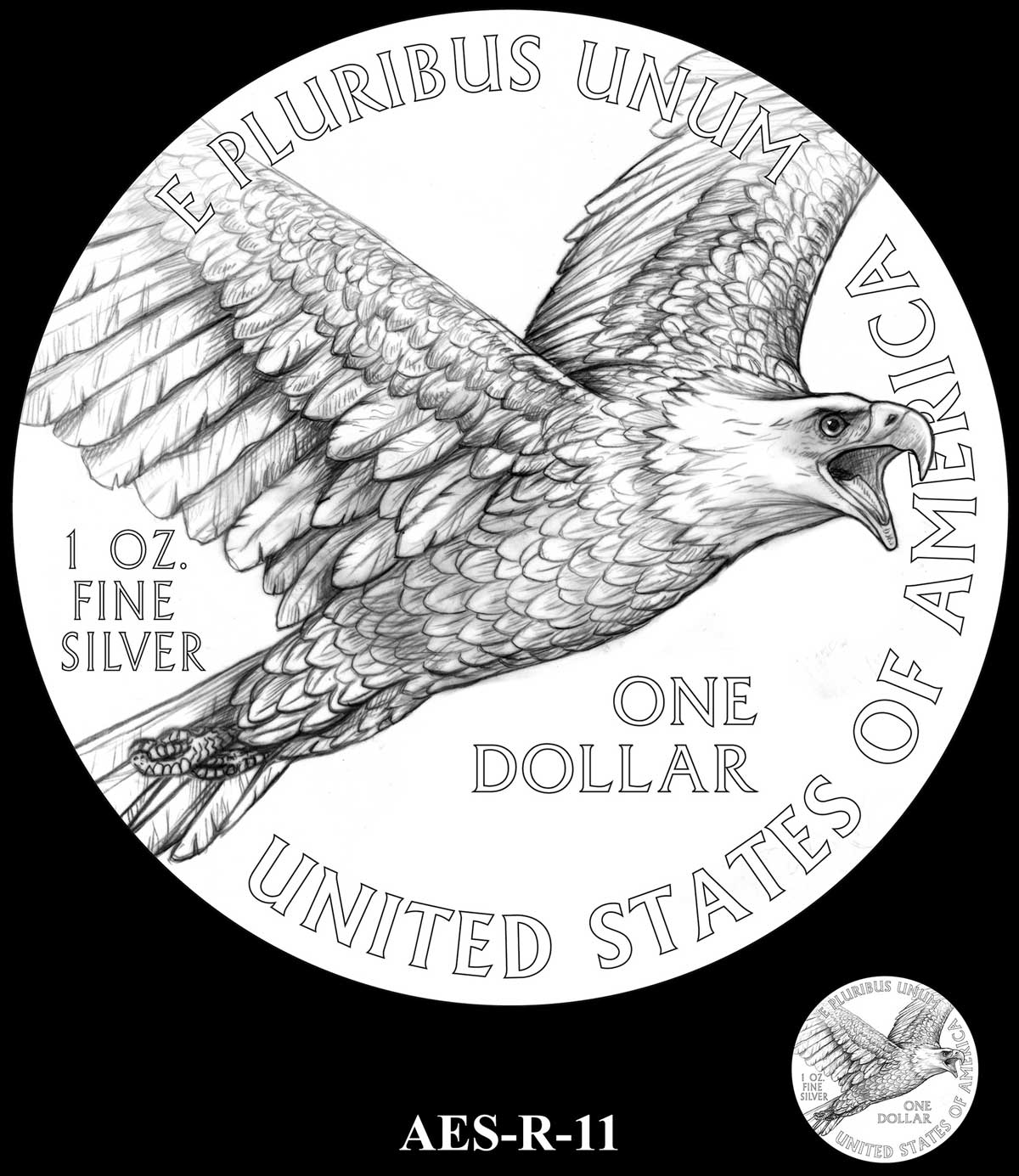
R-11 – IN GOD WE TRUST added in space at top. Denomination changed to symbol
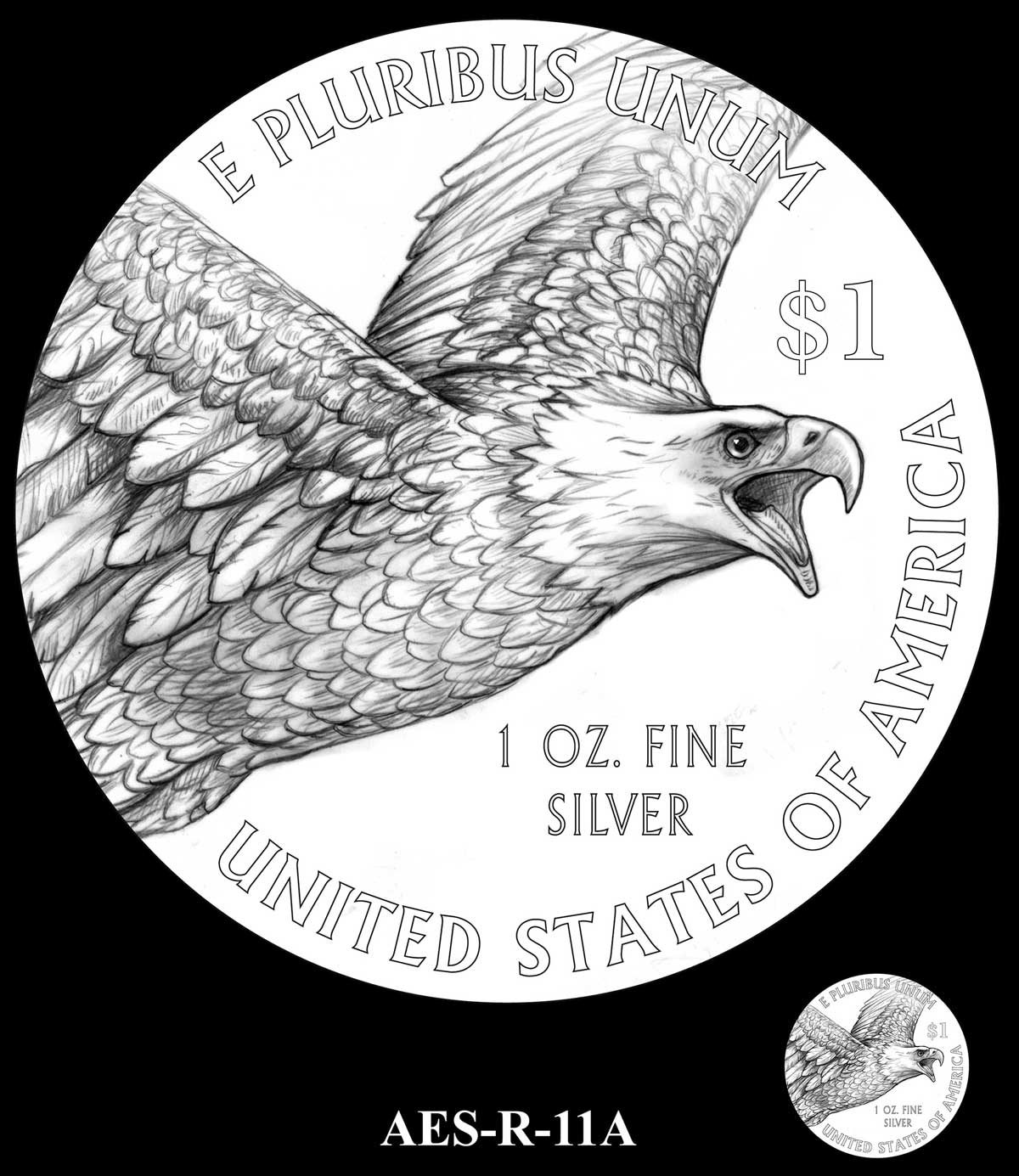
R-11A – IN GOD WE TRUST added in space at bottom
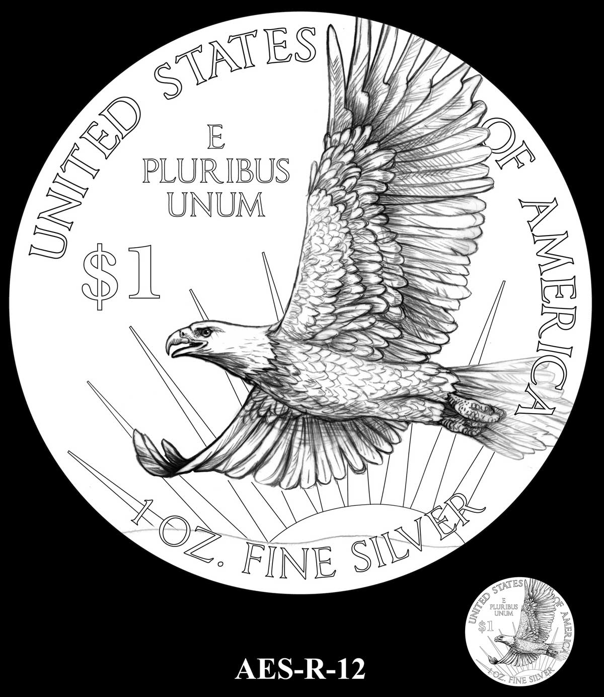
R-12 – IN GOD WE TRUST added to right of composition
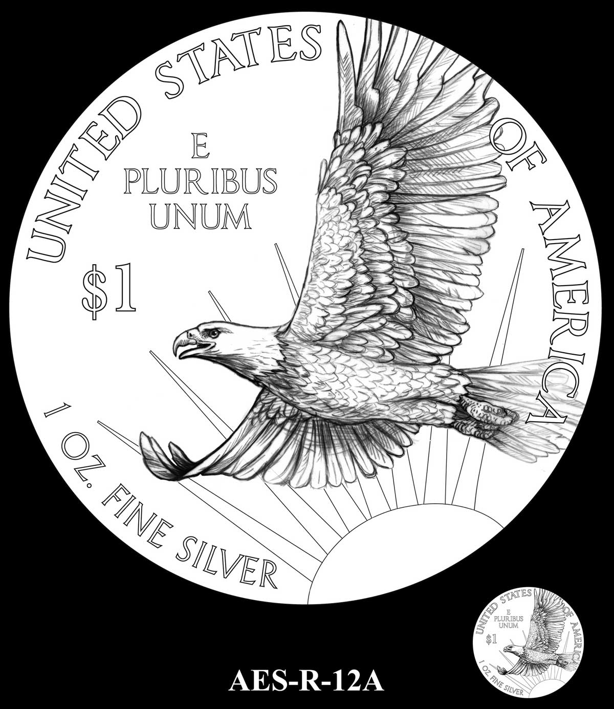
R-12A – IN GOD WE TRUST added to right of composition
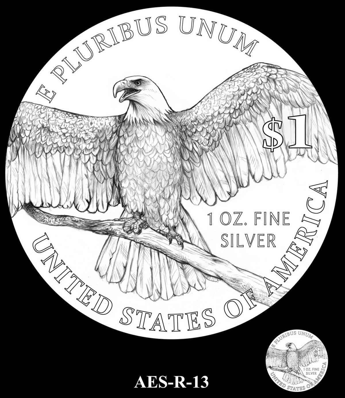
R-13 – IN GOD WE TRUST added under E PLURIBUS UNUM
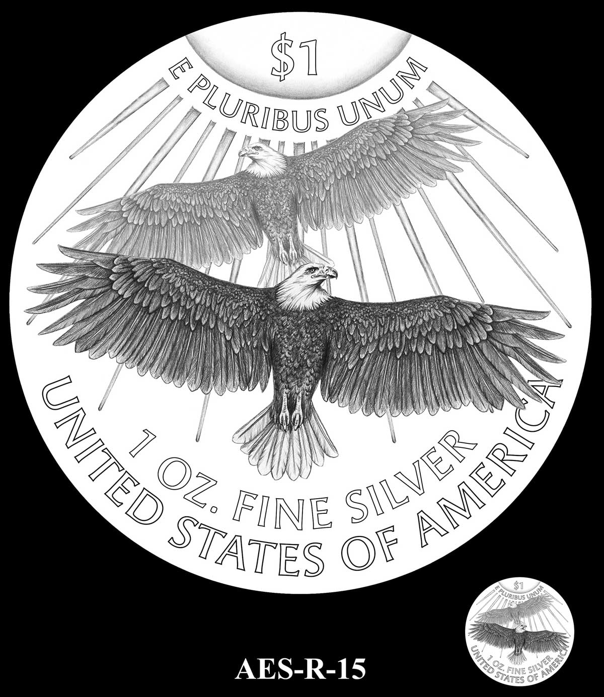
R-15 – IN GOD WE TRUST replaces E PLURIBUS UNUM which is moved to centre-right
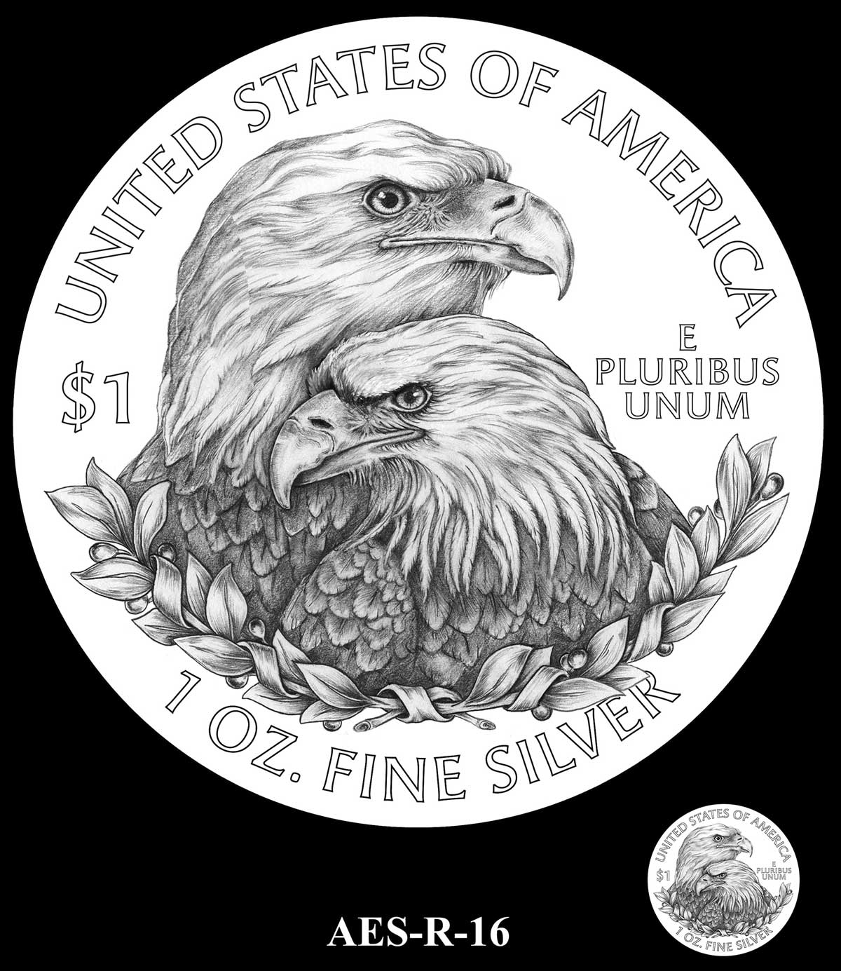
R-16 – IN GOD WE TRUST added to top under STATES OF
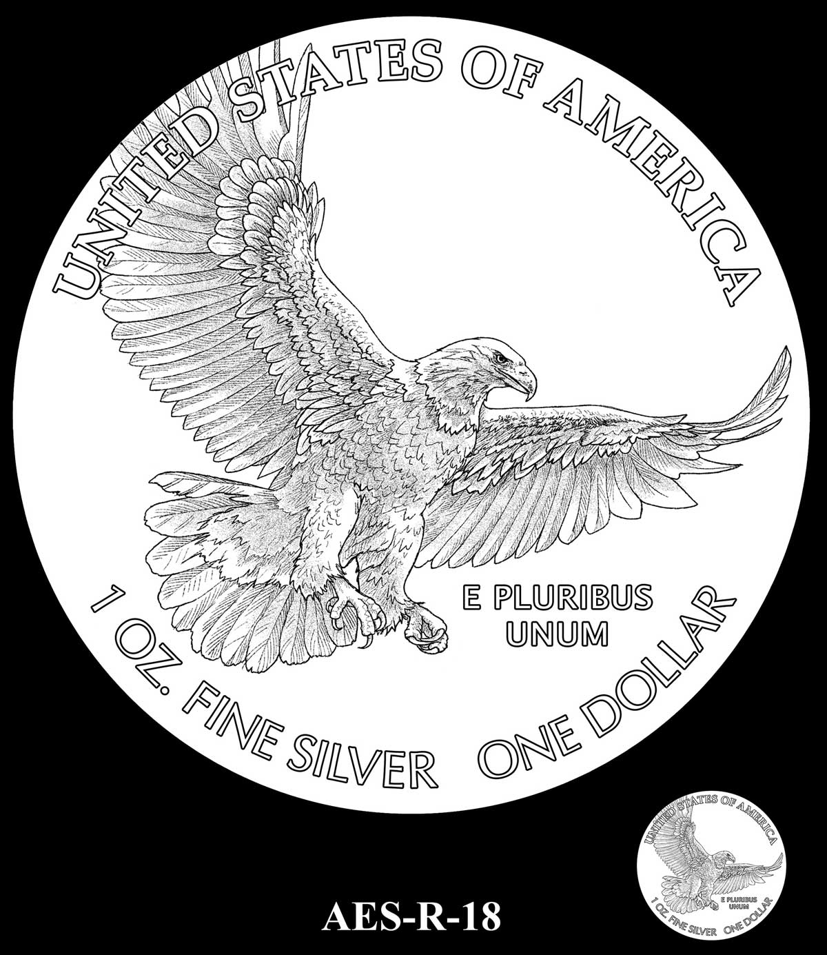
R-18 – IN GOD WE TRUST added to space at top
R-18A – IN GOD WE TRUST added to space at far left
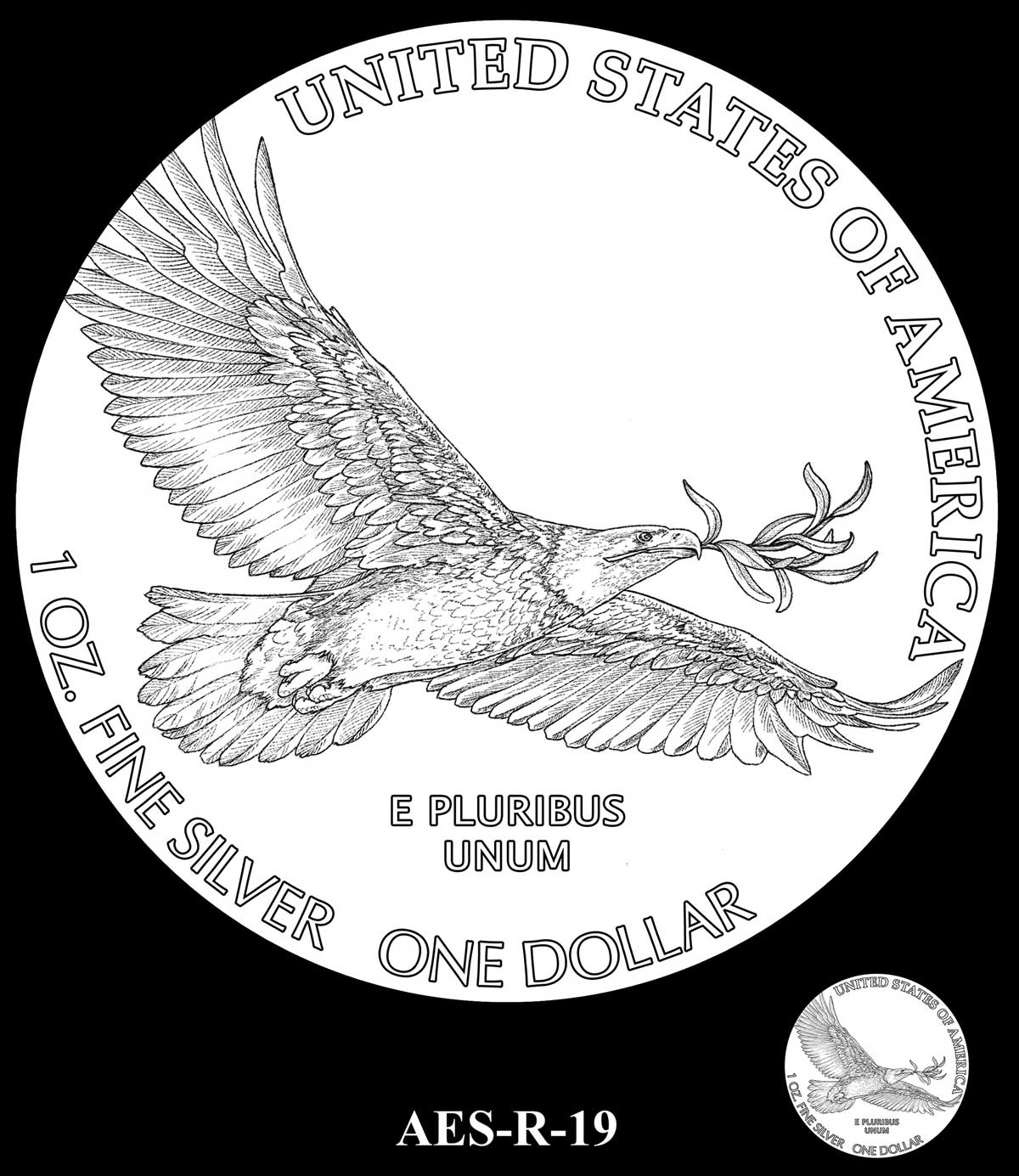
R-19 – IN GOD WE TRUST added to space at top
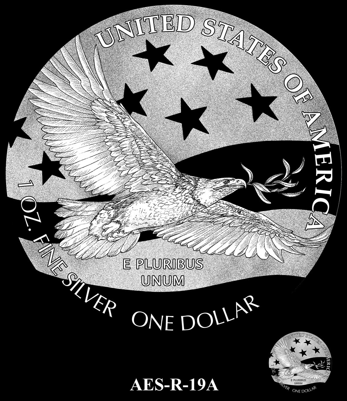
R-19A – IN GOD WE TRUST added above olive branch
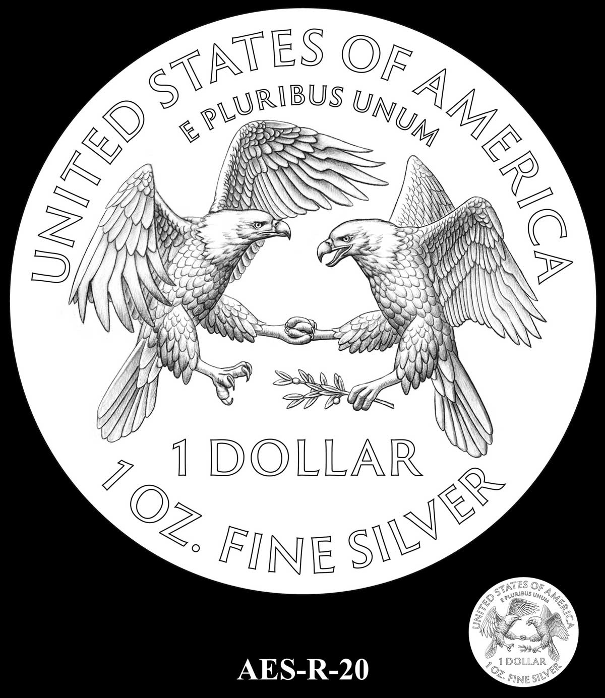
R-20 – IN GOD WE TRUST replaces E PLURIBUM UNUM which is moved to bottom. Denomination changed to symbol
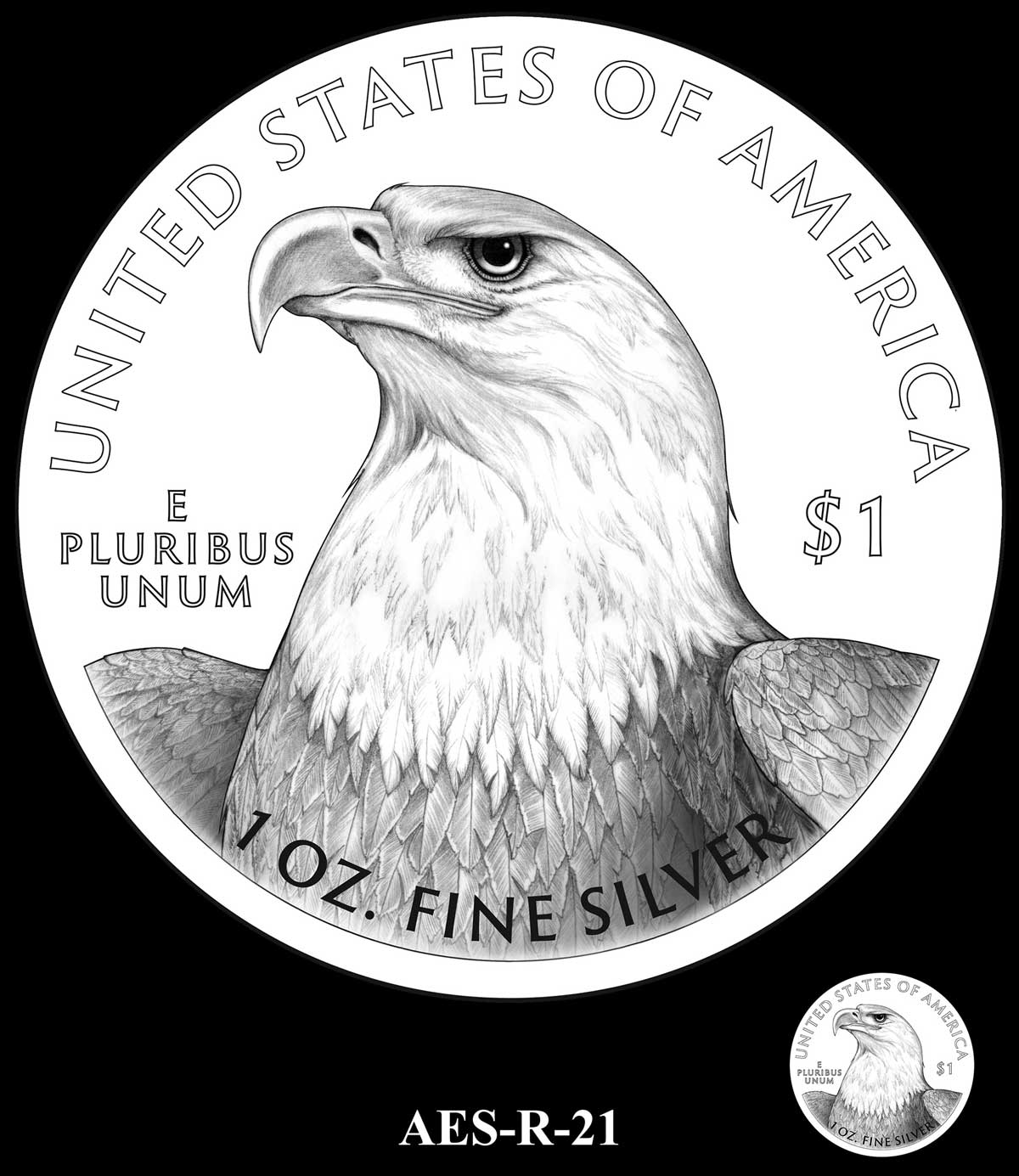
R-21 – IN GOD WE TRUST added in place of denomination, which is moved to left
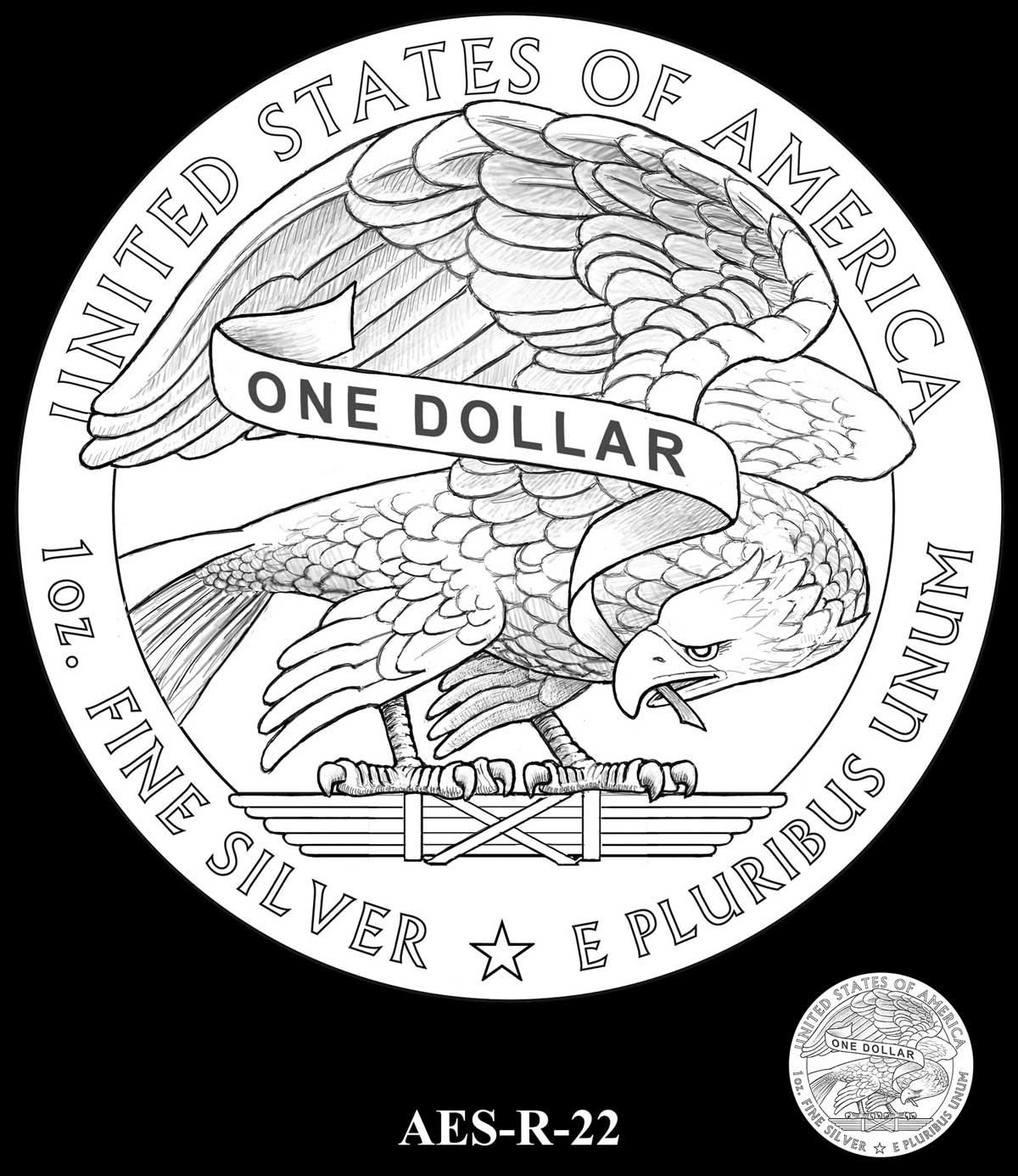
R-22 – IN GOD WE TRUST replaces composition which moves to banner. Symbol denomination at bottom
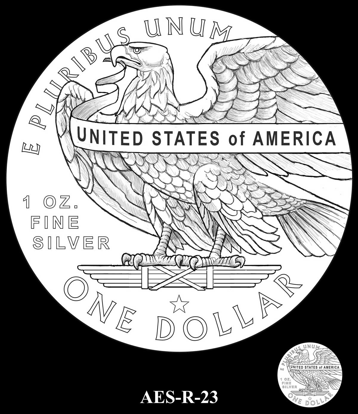
R-23 – IN GOD WE TRUST replaces E PLURIBUM UNUM which is moved to bottom. Border line added
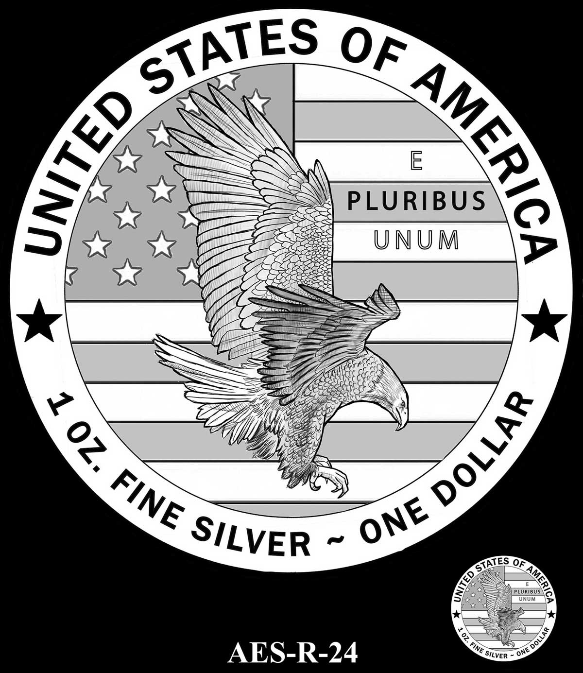
R-24 – IN GOD WE TRUST added below E PLURIBUS UNUM
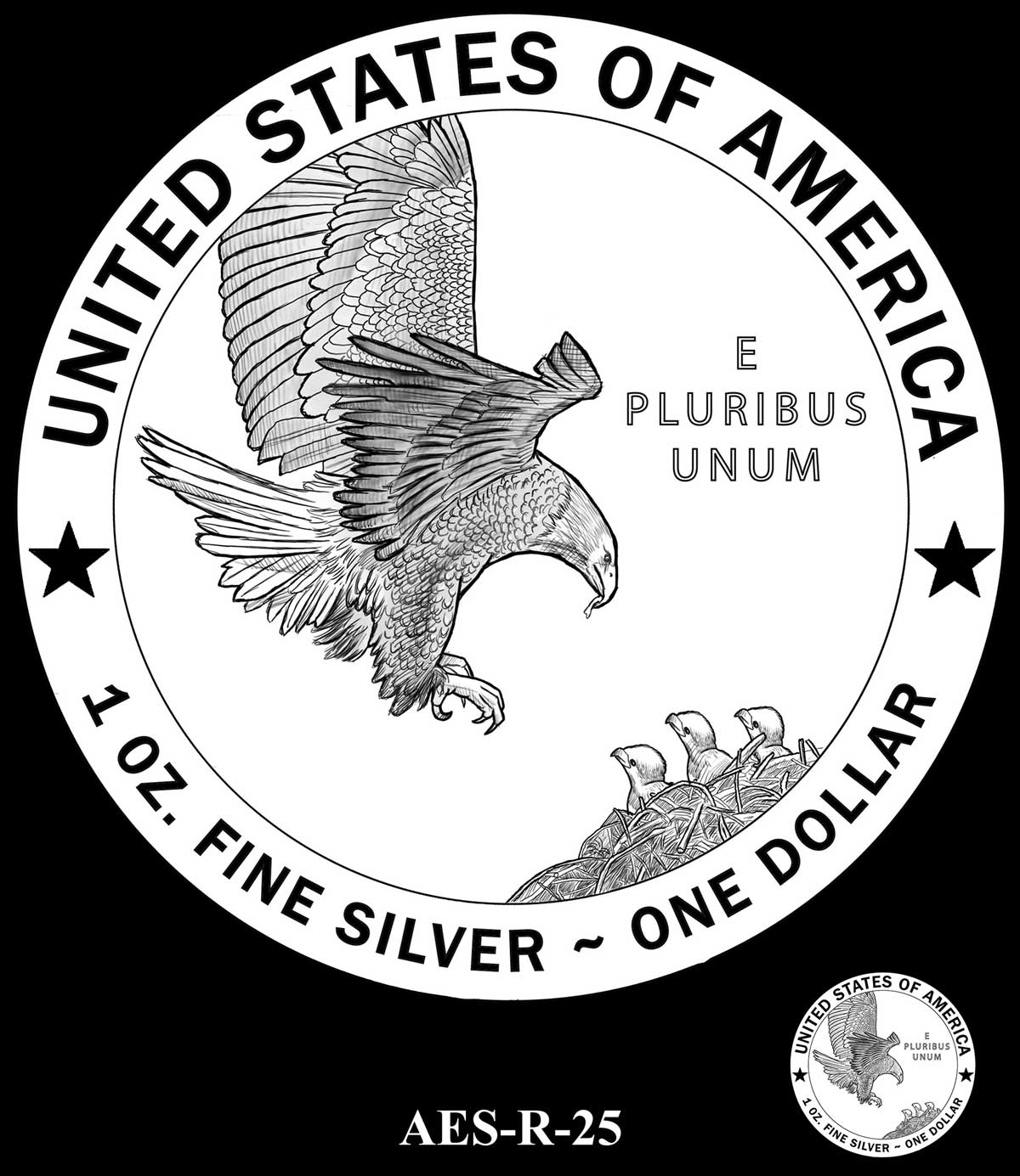
R-25 – IN GOD WE TRUST added in place to right with E PLURIBUS UNUM moving up
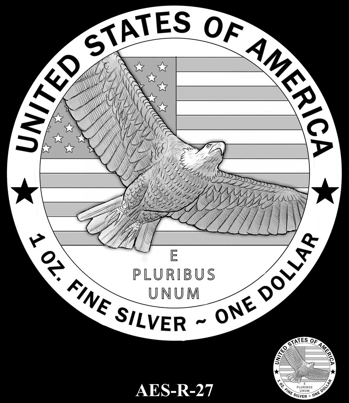
R-27 – IN GOD WE TRUST replaces composition which moves to banner. Symbol denomination at bottom
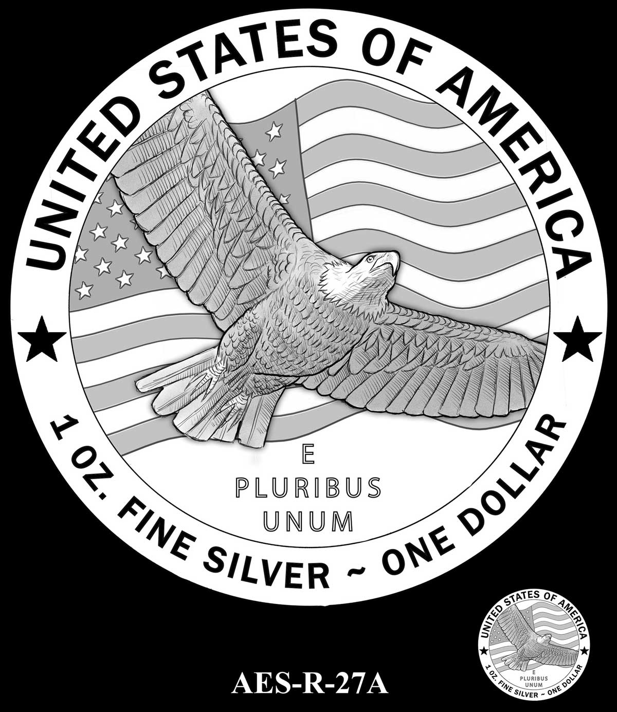
R-27A – IN GOD WE TRUST added on flag at top right
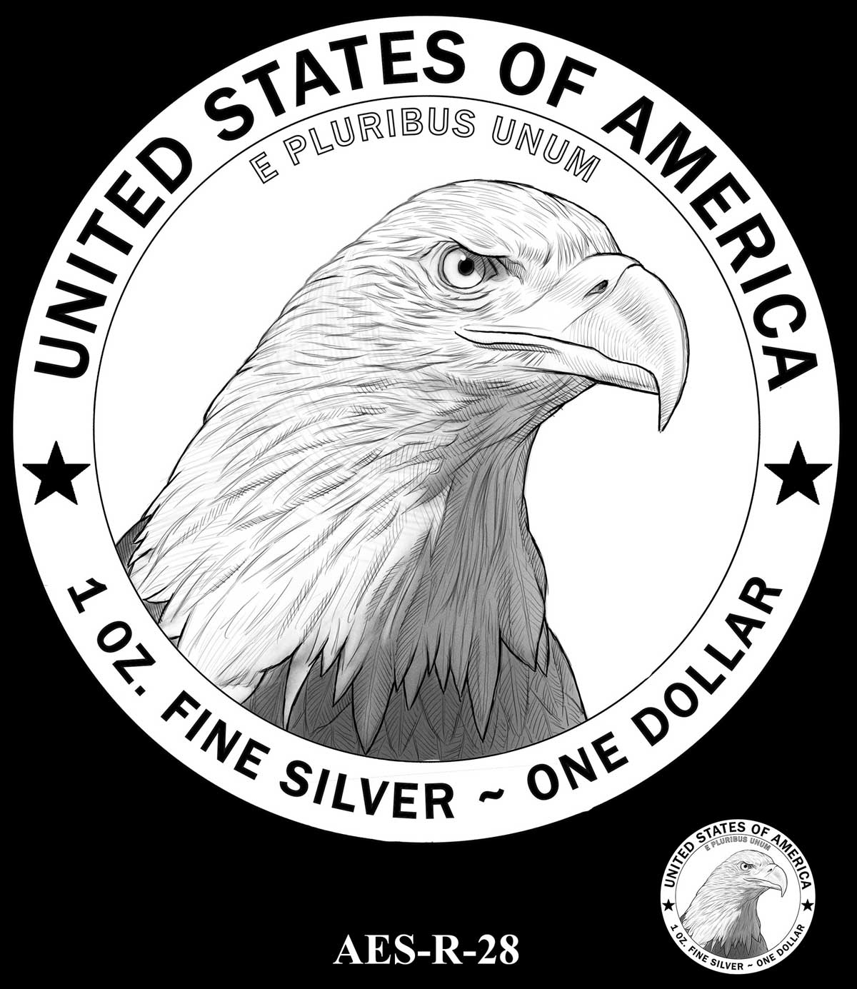
R-28 – IN GOD WE TRUST added to space at bottom right
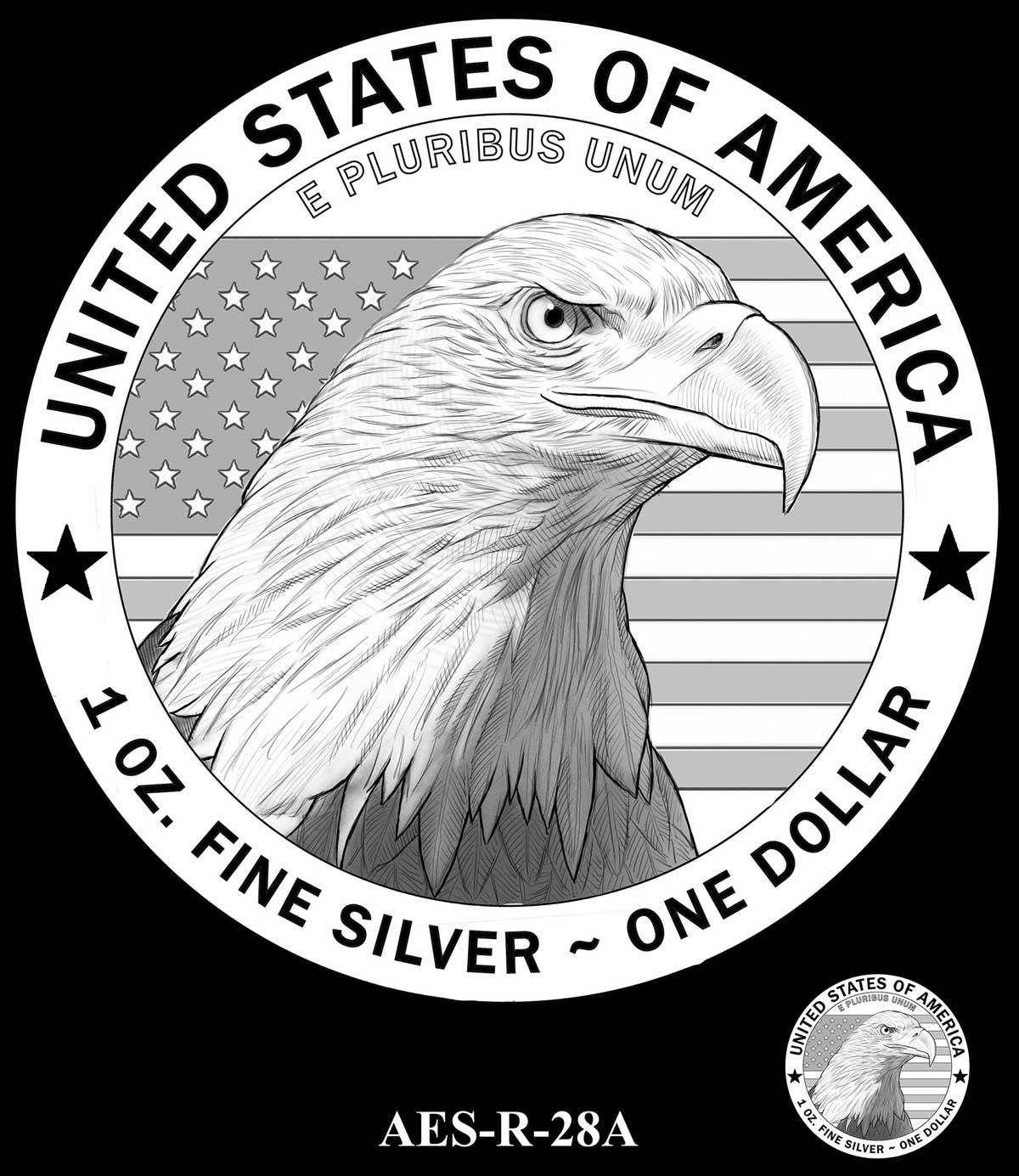
R-28A – IN GOD WE TRUST added in place to right
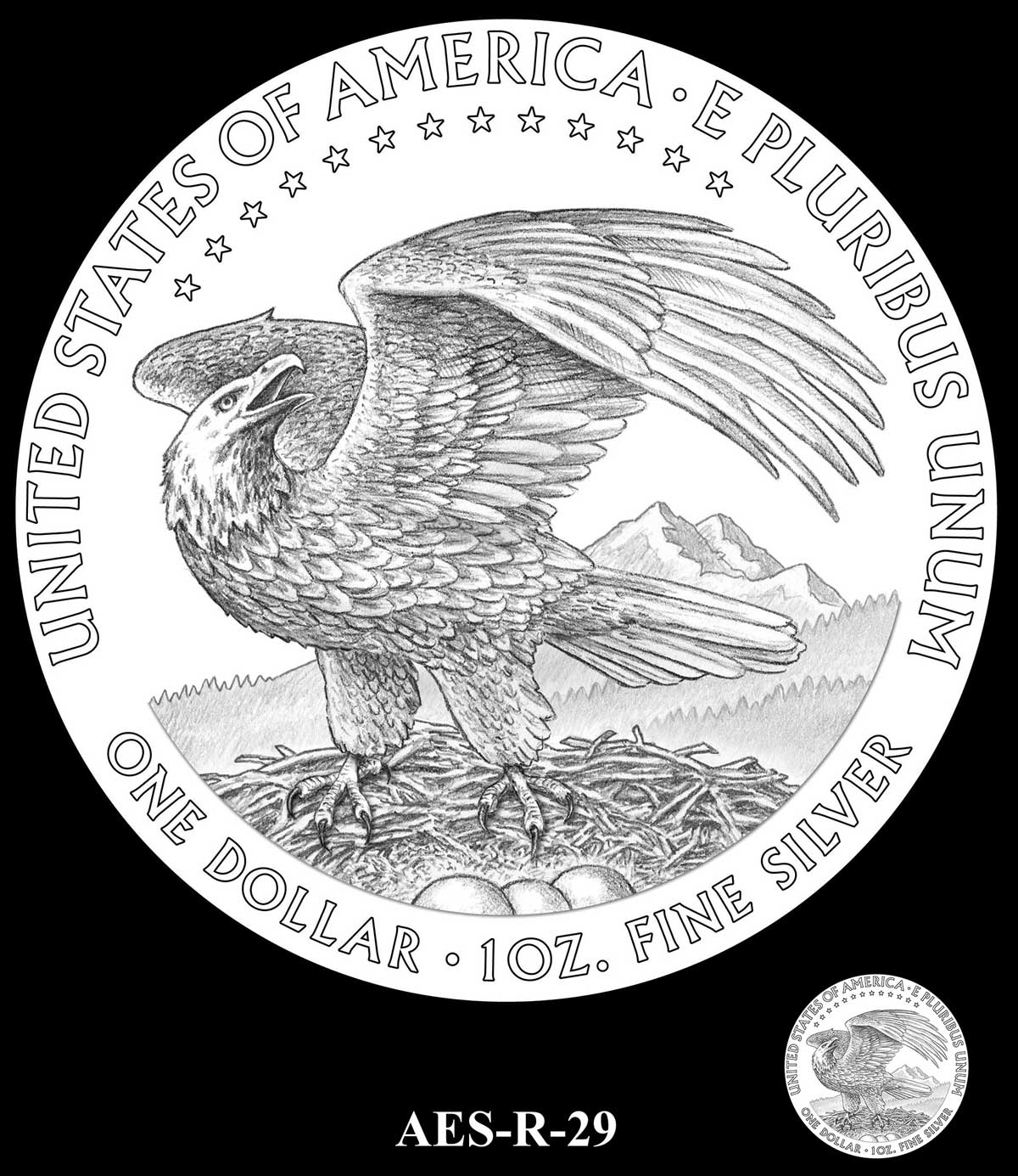
R-29 – IN GOD WE TRUST replaces line of stars
R-30 – IN GOD WE TRUST replaces denomination. Symbol denomination replaces stars
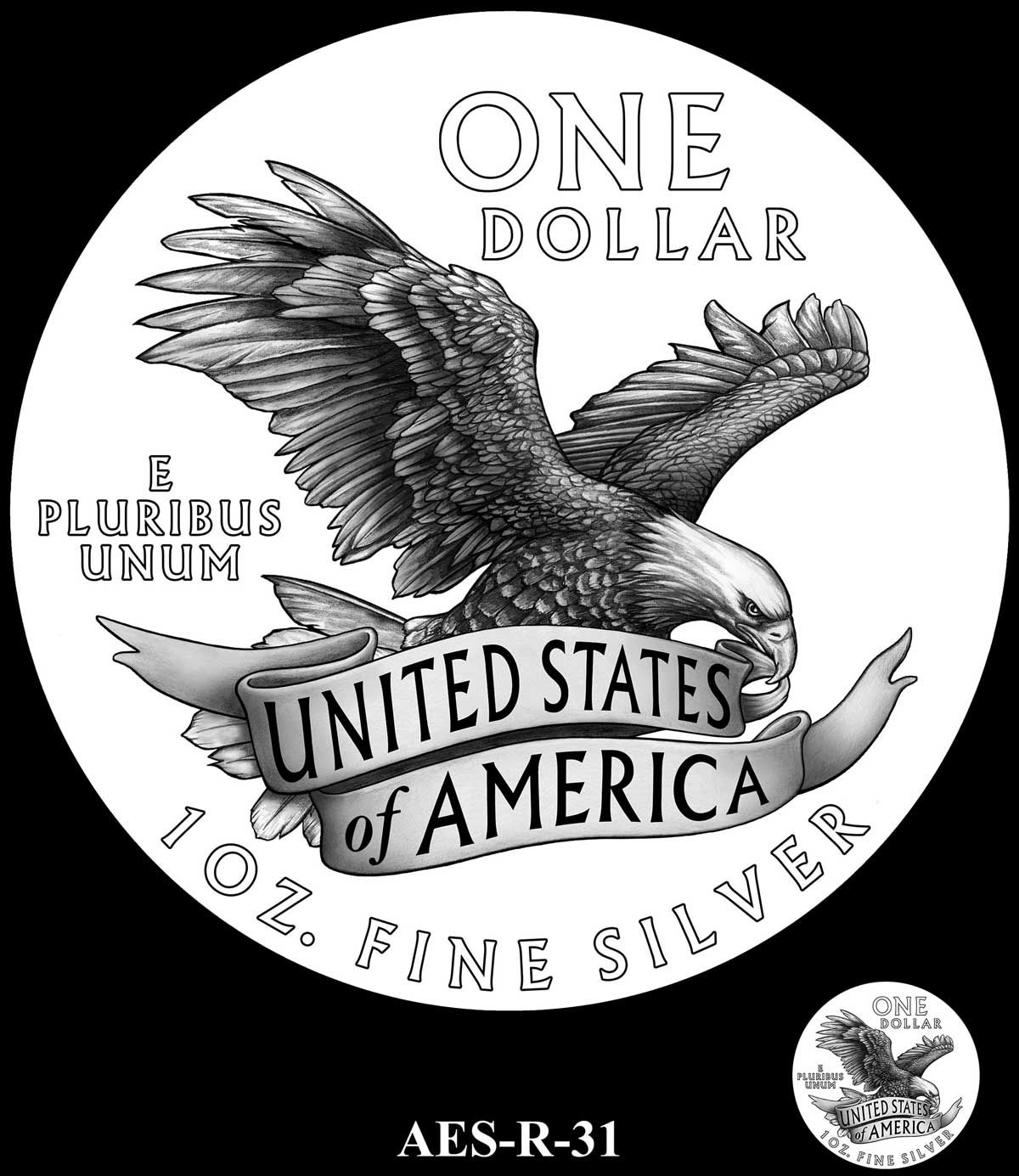
R-31 – IN GOD WE TRUST added to space at right
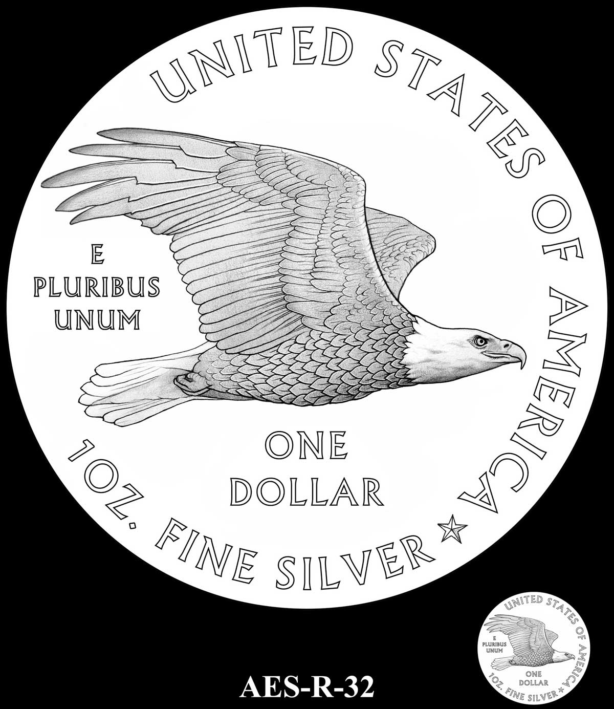
R-32 – IN GOD WE TRUST replaces denomination which moves to top right as symbol
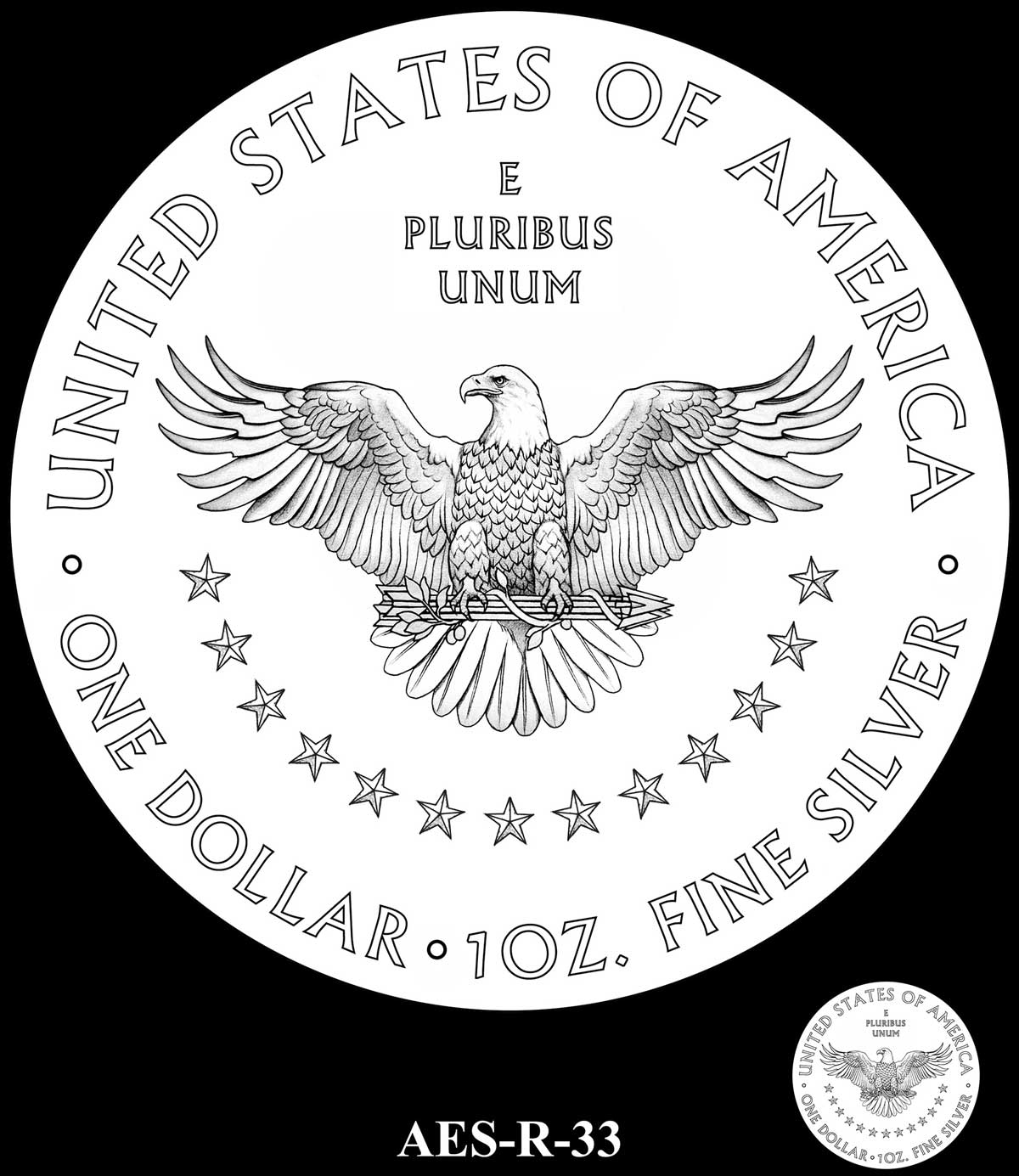
R-33 – IN GOD WE TRUST replaces denomination which moves above E PLURIBUS UNUM as symbol
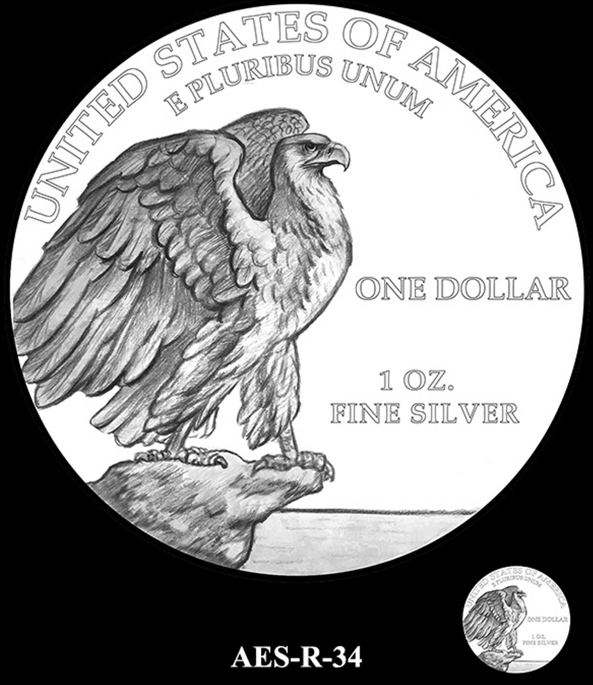
R-34 – IN GOD WE TRUST replaces denomination which moves to bottom right border. Denomination changed to symbol
R-35 – IN GOD WE TRUST added to bottom left border
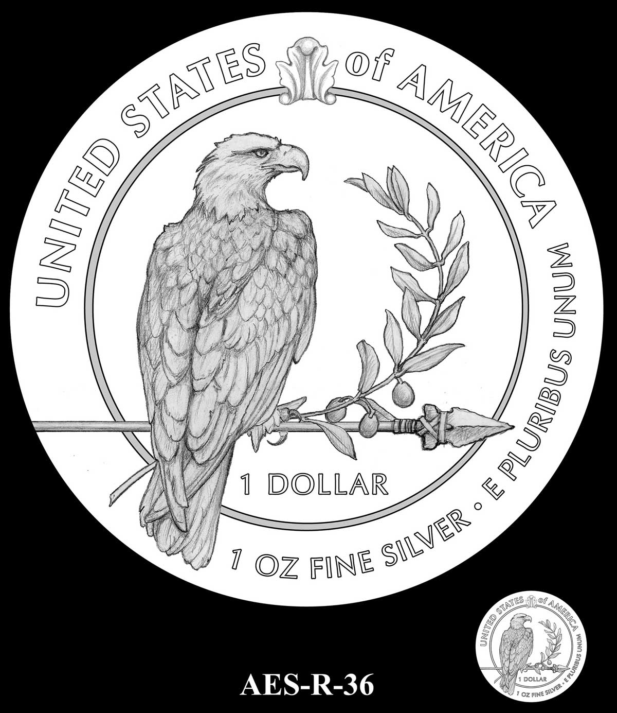
R-36 – IN GOD WE TRUST added to border at right. UNITED STATES OF AMERICA shrunk and moved to top left
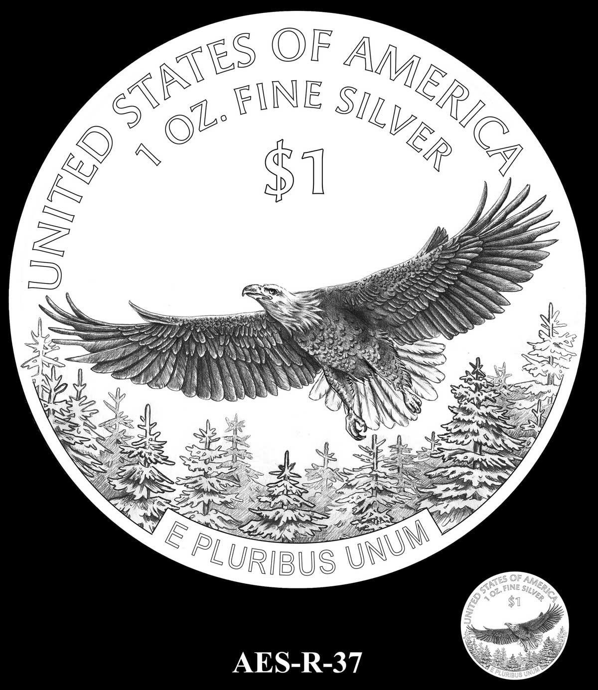
R-37 – IN GOD WE TRUST added to left of E PLURIBUS UNUM. Space is widened to cover some tree background
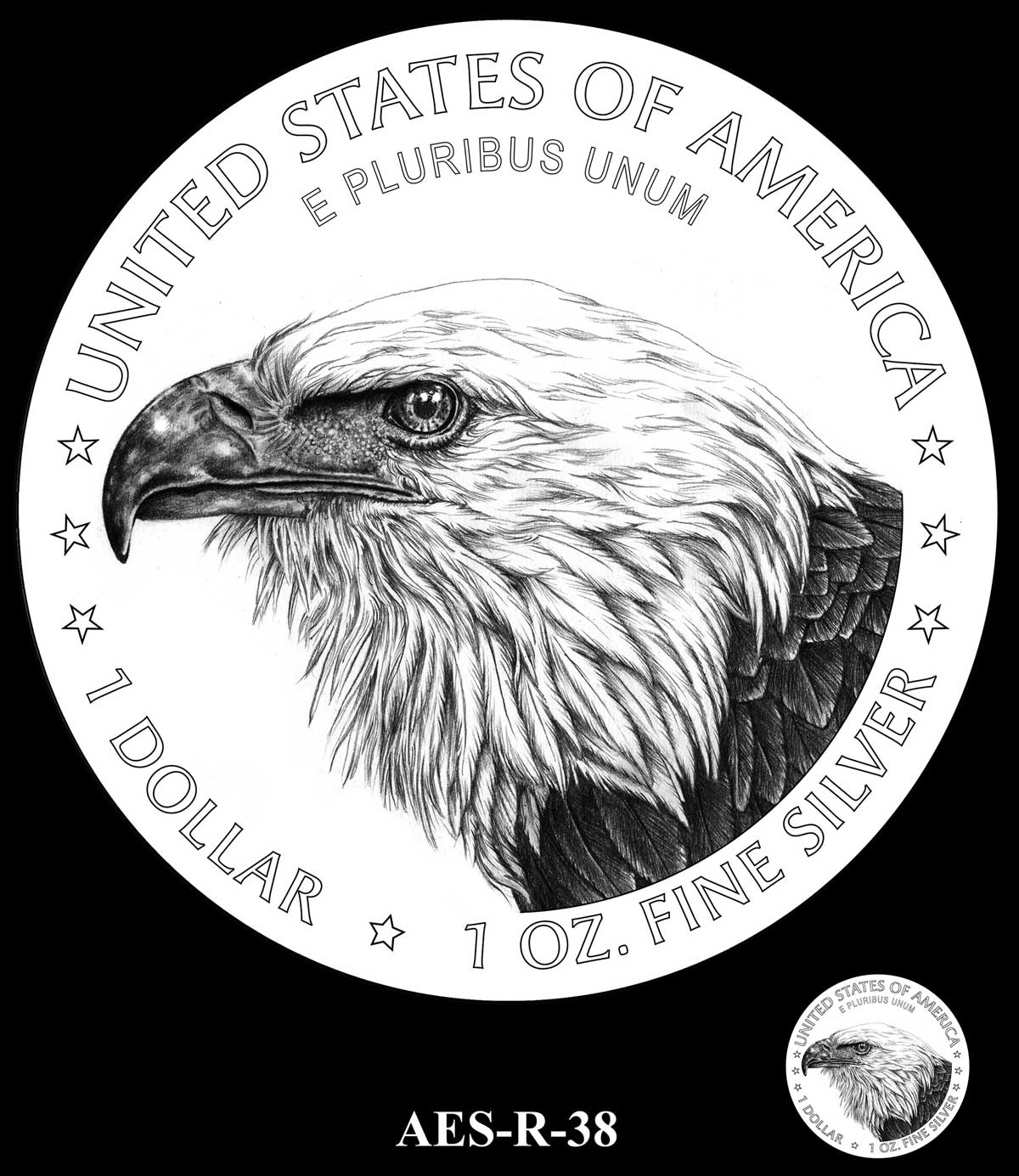
R-38- IN GOD WE TRUST added under E PLURIBUS UNUM
Your Content Goes Here




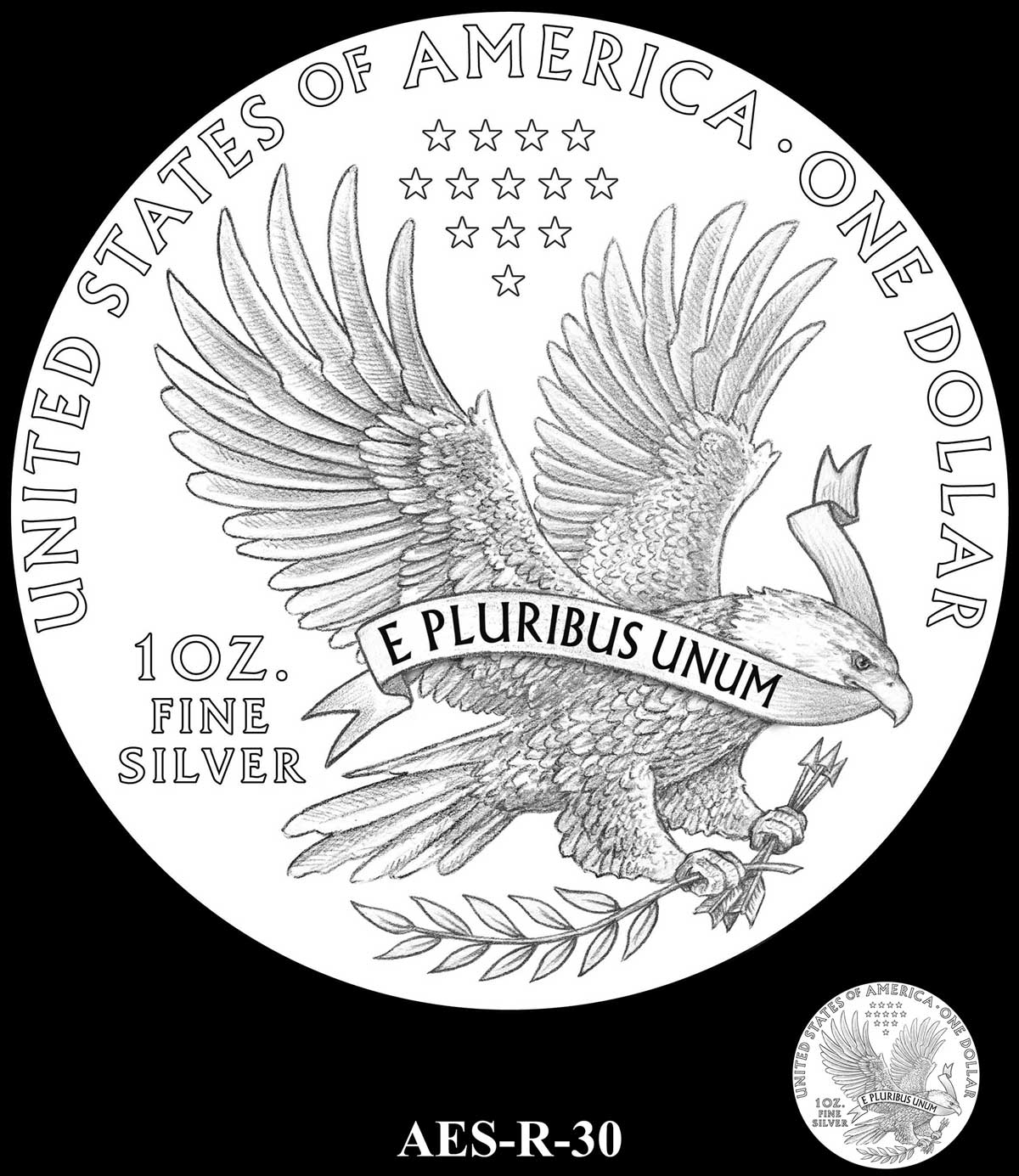
I quite like R30, and one of the few to still have both olive branch and arrows.
So, “in God we trust” is being removed from the liberty side? Is that the only change there?
Nice idea of a box set of selected proof designs that don’t get chosen. I would jump at that. And very do-able too, as the mint now have the freedom to issue what they like without the stifling approval process, in ‘medal’ form. Do you know anyone with the power stateside that you could influence, Mik? 🙂
I’ll have a chat with The Donald.He seems to like a bit of shiny stuff.. LOL
On the medal front, have yoiu seen the proposed Steven Mnuchin medals? I look at crap like that and just wish they’d let the US Mint do their own thing instead of forcing them to do this stuff or the First Wives gold coins. Clearly a lot of talent at the mint, but the political angle is too overpowering and many subjects they’re forced to do are just mind-numbing.
Oh sweet Jesus, i thought you must have been joking. I have just found the Mnuchin medal candidates. I don’t know what to say……
Some good stuff still gets through, thankfully – the 2019 2.5oz Liberty high relief was a shining example of what i would like them to do more often.
So you’ll have a chat with big D then, about the 6 ASE proof medals? Super. That means they’ll be the greatest medals in history, ever, period.
R18A is the clear winner imho. Soaring eagle w/expansive wingspan in higher relief would be numismatically pleasing. E Pluribus UNUM in the sky above eagle balances the face of the coin. Symbolizing freedom-a winner – a collector’s opinion.
I really like the R19A, but also R31. Is there a decision on which design is going to be
R-02 was chosen for silver. R-38 was chosen for gold. Both seem to me to be good, but safe choices. Typical US Mint really.